I had a conversation recently about world building, and if it was more effective to make up places stitched together from real ones, like Capital City or Metropolis, or to take an existing one and make subtle changes to fit the story. I argued that, when writing a story set in the modern world, that the background should be as real as any place and there wasn’t, by and large, a good reason to make one up just to avoid doing the research to get it right.
 |
| Cute — adorable, even, but limited. |
It reminded me of an early story I wrote that suffered from generic setting syndrome. Any background details that did existed were thrown there haphazardly and not in any real sense of historical place. I didn’t see a problem with it at the time — after all, it was the characters that mattered, right? Kind of.
Just shy of two years ago I attended a weekend photography workshop in Toronto. Prior to that, I’d been snapping pictures but not putting much thought into it. Point, zoom, and shoot. Much like that early story, the subject of my photographs filled almost the entire frame, leaving little else for the imagination.
Somewhere along the line, we discussed telling a story through a photograph along with concepts such as the rule of thirds and depth of field. Something clicked in my writer brain; the little gears whirred away in the background and churned away until it could put it in terms I could understand.
One of the most valuable lessons I’ve learned is that there’s a difference between telling a story and telling a story dramatically, and that tenet isn’t exclusive to writing. The words we choose to use to communicate direct how the reader sees our stories. It works the same way for artists and photographers.
 |
| Animated image built from color and black & white with grid source images, demonstrating the rule of thirds. |
Think of the field of view as you tell a story. What details to include? Which should you leave out? Well, the rule of thirds suggests dividing your work into nine equal parts by vertical and horizontal lines. Align your subject along the intersections to create more more dramatic image.
The thing that’s important to your story is in the foreground but the background — the things you include but leave slightly out of focus, contribute to a much broader experience. Below the cut are a few more photographs that may help illustrate the idea.
 |
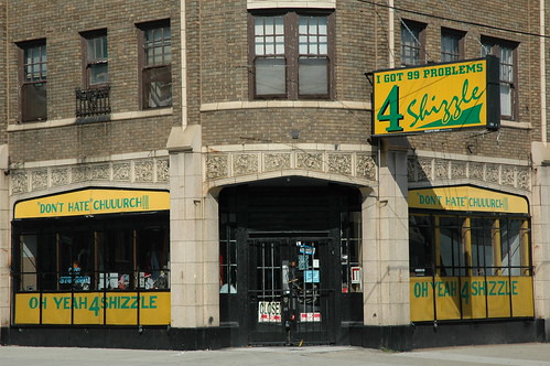
This photograph is zoomed in solely on it’s subject but still tells a story. It’s a building, obviously, but one with a story. It’s an urban storefront, possibly tied to a church — one with a lot of problems (4 shizzle).
 |
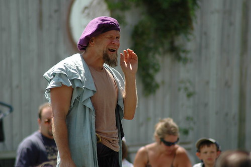
The man wearing the purple hat looks a little bit like Pop-Eye. In the background we see a wall with some vegetation clinging to the side and a few people who are dressed differently than our focal point. He’s an entertainer at the Bristol Renaissance Faire, explaining to the audience that they have been divid into two cities — Sparta and Trojan — and he is their champion. They must cheer the loudest to prove that they are the best, or else he will have to save their honor by eating…mud. Long live the mud show.
 |
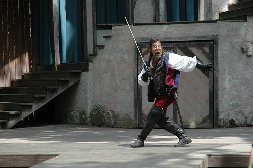
Aha! Here we have Guido of the Swordsman (bold and stupid men, at your service). He’s on stage, caught in the act (but of what?) by his nemesis, Dirk.
 |
Just like a photograph, our words shouldn’t be focused solely on the subject of the story. Zoom out a little bit and give the reader a wider context — setting, side characters, motivations, etc. It’s through the noise in the background that a story emerges, and we see and interpret the world around us.
Comments are closed.